وب سایت تخصصی شرکت فرین
دسته بندی دوره ها

Practice It: CSS Layout

سرفصل های دوره

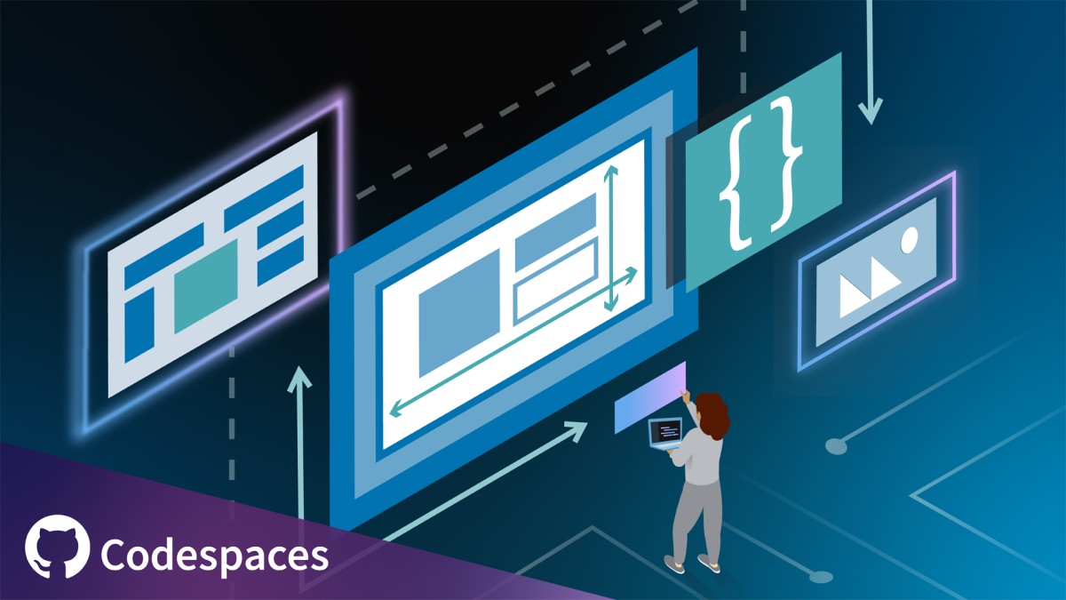
In this course, instructor Julia Dyck shows you how to create responsive web layouts that adapt to any screen size and provide a seamless user experience. Join Julia as she shows you how to design modular layouts using CSS grids and Flexbox, and adapt them to different screen widths using media queries. She provides an introduction to the basics of grid layouts, explains how to make your layouts responsive, and then guides you through the creation of a three-column and a twelve column layout.

This course is integrated with GitHub Codespaces, an instant cloud developer environment that offers all the functionality of your favorite IDE without the need for any local machine setup. With GitHub Codespaces, you can get hands-on practice from any machine, at any time—all while using a tool that you’ll likely encounter in the workplace. Check out the “Using GitHub Codespaces with this course” video to learn how to get started.


01 - Introduction
  • 01 - Creating responsive grid layouts
  • 02 - What you should know
  • 03 - Using GitHub Codespaces with this course

  • 02 - 1. Introduction to Grid Layouts
  • 01 - Designing a grid layout
  • 02 - Defining grid elements
  • 03 - Working with advanced selectors
  • 04 - Grid vs. Flexbox
  • 05 - Try it Create a basic grid layout
  • 06 - Check it Create a basic grid layout

  • 03 - 2. Making It Responsive
  • 01 - Using a mobile-first approach
  • 02 - Using media queries
  • 03 - Changing the layout
  • 04 - Making it accessible
  • 05 - Try it Responsive grid design
  • 06 - Check it Responsive grid design

  • 04 - 3. Creating a Three-Column Layout
  • 01 - Designing a responsive layout with Flexbox
  • 02 - Try it Designing a layout with Flexbox and Grid
  • 03 - Check it Designing a three-column layout with Flexbox
  • 04 - Check it Designing a three-column layout with Grid

  • 05 - 4. Creating a Twelve-Column Layout
  • 01 - Twelve-column layout setup
  • 02 - Twelve-column layout for different viewports
  • 03 - Try it Designing a twelve-column layout
  • 04 - Check it Designing a twelve-column layout

  • 06 - Conclusion
  • 01 - Next steps Advanced layouts and UX
  • 45,900 تومان
    بیش از یک محصول به صورت دانلودی میخواهید؟ محصول را به سبد خرید اضافه کنید.
    خرید دانلودی فوری

    در این روش نیاز به افزودن محصول به سبد خرید و تکمیل اطلاعات نیست و شما پس از وارد کردن ایمیل خود و طی کردن مراحل پرداخت لینک های دریافت محصولات را در ایمیل خود دریافت خواهید کرد.

    ایمیل شما:
    تولید کننده:
    مدرس:
    شناسه: 20498
    حجم: 254 مگابایت
    مدت زمان: 113 دقیقه
    تاریخ انتشار: 15 مهر 1402
    طراحی سایت و خدمات سئو

    45,900 تومان
    افزودن به سبد خرید